It’s been a while since I’ve tackled the issue of banner ads. Although they continue to grow in popularity – they are, in fact, a mainstay in the Internet advertising culture – it’s easy to forget that they’re not the simplest things to create effectively until you’re faced with having to do them. A great banner ad must convey your message, build brand awareness, generate click-throughs, and boost sales.
Getting all of this from a single little graphic tucked into the corner of someone else’s web page can seem impossible.
In 2000, Nielsen/NetRatings performed a survey that showed the right design in a banner ad can actually entice viewers to click. In other words – yes, banner ads can have a good click-through rate. It’s not all about brand awareness. But you need to design and implement your banner ads with the idea of getting clicks in mind.
We’ll get to the actual Photoshop tutorial in just a second – I promise. Here’s what our design in Photoshop should do, though:
Short and Simple: You need to catch a viewer’s interest in under 10 seconds. The more words your ad stuffs into a small space, the less likely they’ll be read. Animated GIFs and flash banners can trigger action, but you want the viewer to remember your name so don’t clutter it up and reduce your banner’s ability to brand.
Reason to Click: Your banner has to be attractive and interesting if you want to flutter a single eyelid. The chance to win something, get something for free or at a special discount, and products that make life easier will get the biggest response. Persuade people to visit your site by giving them a good reason to go there.
Tie-In Design: Really good banner ads are part of an overall advertising strategy. Each piece of your advertising strategy needs to be designed in a way that visibly goes together – different sized banner ads should feature the same colors and general graphics or backgrounds, for example.
So in our Photoshop-created banner ads, we want to get our compelling message across fast in a design that works well with other advertising pieces. Doesn’t sound that bad, does it? It really isn’t!
Creating Great Banner Ads in Photoshop
Step One: Banner Size
Before we can get to designing anything, we need to know what banner sizes should be made. Different websites have slightly different sizing guidelines, but there are some standards that most reputable sites adhere to. The standard horizontal banner is sized at 468 x 60 pixels, with its very-large counterpart, the leaderboard banner, sized at 728 x 90 pixels. Of the two, the most popular is the standard banner. Vertical banners are usually called a Skyscraper, sized 120 x 600 pixels. Some websites actually prefer buttons or rectangles – want to have quick access to all the standard banner sizes? Altlab has created a great reference chart you can grab here.
We’ll be working with a standard horizontal banner in this tutorial, but each piece can be applied to banners of all sizes.
Step Two: New Canvas
Open Photoshop and create a new canvas (File, New) that is sized 468 x 60 pixels in RGB mode.
Step Three: Gradient Fill
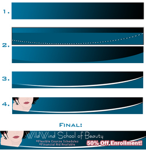
We’re going to fill our background with a blue-to-black gradient. Set your foreground color to a deep blue, and your background color to black. Then, use your Gradient tool (it hides behind the paint bucket in your tools palette) to drag a gradient that is black in the bottom right corner and blue in the top left corner. (See Illustration)
Step Four: Visual Interest
We’re now going to draw the eye in with a few pieces that will create some serious visual interest. Our first step is to create a bottom “divider” that creates an illusion of “ending”. In other words, with the bottom in a dark color, a reader’s eye will naturally stop at the banner because the web page seems to “end” with the banner – an illusion. To do this, set your foreground color to a darker shade of the blue you’re using and draw a rectangle across the canvas. Then, use your elliptical (circle) marquee tool to cut out the top part of the rectangle, creating a gentle curve. (See Illustration)
Now, repeat this step using white to echo the curve made (See Illustration).
Step Five: Insert Art
We now want to add a humanizing element – something that the viewer can relate to and immediately recognize. Facial features are perfect for this – we learn from the time we’re first born to look for facial shapes. Using these in your design automatically draws more interest.
Just make sure that whatever art or product picture you use compliments the colors already present in your banner, and experiment with placement and sizing. Moving a graphic just a few pixels in a different direction can convey a whole new message. (See Illustration)
Step Six: Insert Text
The text can actually be the trickiest part of all. You want the name of your company to stand out and it should be written in the same font as it is on your logo. Information text needs to be small – pixel fonts are great for this – and in a contrasting color that sticks out. Finally, you need the “draw-in” – the thing that persuades a viewer to click. This text should be thick, bold, and extremely visible.
In the example banner, the school’s name stands out not because it’s big and bold but because it’s white and dainty compared to the other elements in the banner. Information text is very small and in a contrasting pink color that still works well with the other colors in the banner. Finally, the draw-in – 50% Off Enrollment! – is actually smaller in size than the school name but because it’s bold and stroked in the same pink as the information text, it is one of the first things the eye sees.
Make sure that you maintain balance in your ad once you’ve added text. In the example, nothing descends below the height of the divider on the bottom of the banner where the art is visible above it. This trains the eye up, to our text. By keeping information and draw-in text below the school name, it gives the school name a place of importance … building on branding.
Keep these key points in mind with every banner ad (and print ad, for that matter!) that you design, and you’ll see a difference in the effectiveness of your campaign that can’t be put into words.