Microsoft Excel is an integral part of every office environment. Almost everyone uses it on a regular basis. However, not many know all of the tricks to taking your spreadsheets from dull and average to Super and Exciting. I am going to show you a few of the tricks on how to save time and make your spreadsheets more functional and more fun
Creating a stand out Table
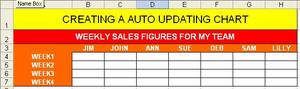
The first step to making a very nice auto updating Chart is to have a nice table that is very easy to add data into. I suggest using colors and lines to set apart the headers from the areas where data is to be entered. Click on the link below to see an example. If you need help creating this kind of table, see my previous entry “Microsoft Excel Timesaving Tips and Tricks.
Click Here to view.
Enter Data
Next enter some bogus data just for the purpose of creating the charts. If you have real data by all means use it. But if you don’t have the data, then make it up and type it in.
After you have the data entered into the blank cells, choose the data range by highlighting all of the data including the headers and row names. Now click on the chart wizard button to start the process. Click on the link below to see an example of this.
Click Here to view.
Creating the Chart
After clicking on the chart wizard you should have a pop up screen that will guide you through the process that looks like the picture in the link below.
Click Here to view.
When the wizard pops up make sure that the Bar chart is Highlighted (or whichever you choose to use) and click Next. Then the next page will come up and show you a small example of what the chart will look like. You have 2 choices on this page, to show the chart by columns or by rows. The default is usually best but choose what you think works for you. Click next when you are done. (Click on the link below for an example of this page.)
Click Here to view.
When the next page comes up you are given the chance to change details about the chart including name of the chart and whether you want the data displayed on the bars, etc. Click on the link below to see an example.
Click Here to view.
When looking at this page, be sure to type in the Title of the chart if it has one then click on the Data Labels Tab and put a check mark in Value. This will ensure that each of the bars shows the value above it. When you are done with this click next again. Click the link below for an example
Click Here to view.
This will bring up the final page of the wizard which asks you where you would like to put this chart. In most cases you want to keep it on the same page as the table. The best place is directly below the table so you can see the results on the chart as soon as you change the data on the table.
Click on the link below for an example.
Click Here to view.
Formatting the Chart
Once you click the finish button a chart will show up right below the table.
Now something to remember is that this table will probably be too small to use.
You can easily click and drag the chart to be the size you want to suit your needs. Click on the link below to view my final graph.
Click Here to view.
Now that your chart is finished you have what you need. The chart is linked to the data in the table. So, all you have to do is change the data and the chart will change. I’ll go through and change the data so you’ll understand what I’m talking about. I’ll put in another set of random numbers and then click on the link below to view the new chart.
Click Here to view Table with Changed Data.
Click Here to view the Chart with Changed Data.
You can see by the previous charts that no matter what numbers you put in, the chart will change to match it as long as you put them in the boxes that you have specified. So now in order to save this as a template to use, simply make all of the data zero’s and save it in the format “chartname_template.xls”.


")