Microsoft Excel is an integral part of every office environment. Almost everyone uses it on a regular basis. However, not many know how to integrate it into other database applications like Microsoft Access or other databases. This tutorial will show you how to create a completely user friendly pivot table and chart from scratch.
Creating the Database
Creating a database is a completely separate matter that should be addressed in another tutorial. This tutorial assumes you already have an external database located on a shared drive and you wish to access that information into a pivot table and chart either on your computer or on the shared drive.
Creating the Pivot Table & Chart
Starting with a blank worksheet in excel, simply click on the Data dropdown menu and scroll down to “Pivot Table and Pivot Chart Report” and click. Click on the link below to view an example of this.
Click Here to view.
Once you click on this you will see a pop up window. This window will give you a few choices as to what kind of chart you want and where the data is coming from. For our purposes please choose “External Data Source” on the top choice, and “Pivot Chart Report, with Pivot Table Report” for the bottom choice. This gives you the most for your money so to speak.
Click on the link below to view the popup window.
Click Here to view.
Once you make your choices on this window another will pop up that lets you find the external data source. When the window pops up, choose “Get Data” and this will guide you to another popup window. Click the link below to view this window.
Click Here to view.
Once the new popup window comes up, choose which type of database you will be pulling from. ODBC, dBASE, Excel, or Access. For my use, I’m choosing Microsoft Access since that is the database I have to work with. Click below for a view of this pop up window.
Click Here to view.
The next pop up window lets you locate the external data source. Now the data source can be anywhere. It could be either on your computer, on an external drive such as a flash drive, or on a shared or mapped drive. A shared drive would be in the format \drivefoldersubfolder etc. and a mapped drive would be something like Z:\driveshareddrivefiles etc. So in this pop up you must locate your file in your drive. Once you have located it you can click OK and the next screen will come up. Click on the link below to see an example of this pop up screen.
Click Here to view.
If you did everything correct in the last screen you should now have a popup that shows you the tables within the database and is giving you the options as to which fields to display. Click on the link below to view an example.
Click Here to view.
Once you are showing this screen you can choose the tables you want to use and choose the fields within that table and move them from the left to the right section by clicking on the arrows. Click on the links below for an example of this.
Click Here to view.
For the next 2 screens generally just click next and let Excel take care of it. Then you will come to a screen that says Query Wizard Finish. Click on Return Data to Microsoft Excel and click Finish. Click on the link below to see examples.
Click Here to view.
Click Here to view.
Once you have completed this section you’ll be back to the Pivot Table and Chart Wizard. Click Next. Click on the link below for an example.
Click Here to view.
In the last step of the wizard, choose to put the chart in the open worksheet and click on the cell A1 (or the very first cell) as the starting point. Click on the link below for an example.
Click Here to view.
Formatting your Pivot Chart
If all has gone right you will now have a blank chart covering a whole page. And there will be all of the fields you chose in a box to the right of the chart. Click on the link below for an example.
Click Here to view.
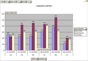
Notice on this picture I have marked circles and arrows. At this point, all you do is determine where you want each of the fields to go. And, how you decide determines what you measure and how the chart turns out. The best part about a pivot chart is that you can change it as much as you want at any time without disrupting the original data because it is external. Also you can update the chart with a click on the Exclamation Mark at any point. Click on the links below to see where I placed my fields and how it turned out.
Click Here to view.
Now that you have your data in the chart, you may not like how the chart is representing it. The default is the stacked bar graph which I personally find confusing. To change the way it looks, simply right-click on the chart area and choose Chart Type. Click on the links below to view an example.
Click Here to view.
Once you’ve chosen the type of chart you like (standard bar graph, line graph, etc.) you can then change the way the graph or chart looks. Right click on the chart area again and choose “Chart Options” This will bring up another pop up window where you can give the chart a title and add data labels among other things. Click on the link below for an example.
Click Here to view.
Once you have made the changes your chart should look much better and be closer to the way you want it. Although, remember with a pivot chart you can change a lot of things automatically. Play with the different fields and move them around and see what happens. This is the best way to know which is the best look and use for the chart. Click on the link below for an example.
Click Here to view.
Once you’ve made your changes remember that you can always change back. Nothing is permanent on a Pivot Chart. In my example on the link below, my choice looks too crowded and I must change back.
Click Here to view.
Another important function of the Pivot Chart is your ability to filter the chart by only certain selections within a field. Say for instance you have the field “Salesmen” and within that field you have 3 choices, Bill, Ted, and Sue, You can just choose one of them by clicking on the dropdown arrow, clicking choose all (which blanks it) then clicking only on the one you want to choose. This can be done on any field on the entire chart except the ones you put on top.
Click on the link below for an example.
Click Here to view.
The last thing is that if you look at the bottom tabs you should see that you are on the first tab. Click on the 2nd tab and you’ll notice the Table that backs this whole chart up. The table can be used for reports and data as well. Each time you make a change on the chart, it changes the table and vice-versa. Click on the link below for an example.
Click Here to view.
That is all for this lesson. If you have trouble just refer back to the document as you need and ask your IT department for help, especially on the external data part. Be sure you have proper authority to access the data. Good Luck – Vince Pendley