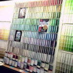
Well, the time has come to repaint the kitchen. Determining what color to use is the hardest part. There are several factors that go into paint choice:
1. What kind of atmosphere do I want in my room? In this case, it is a kitchen; bright and airy, yet cozy and comfortable are the feelings I want to evoke in my kitchen.
2. What size is the room? If the room is large, with plenty of windows for natural light any color you choose is fairly safe. If the room is small, or if the windows are not allowing for ample natural light, you should stick to lighter colors. My kitchen is 18X22 and has large windows that allow a lot of natural light to enter.
3. What are the cabinets and appliances? My cabinets are white, which allows me to use color liberally. Most colors work with white cabinets.
A great choice with white cabinets for a bright cheerful kitchen is the Seaside Serenity color scheme by Behr.
If your cabinets are a dark colored wood such as walnut, paints from the warm side of the color wheel work best. Choose from the many shades of warm yellow and crème colors such as Valspar Ultra Premium Hayloft 2006-2A . This is a great color pallet for a Tuscan kitchen. If you prefer a more modern look, Behr has put together a nice color scheme with the use of greens and darker woods here in the Urban Kitchen If your kitchen is equipped with stainless appliances and white or light colored woods and you prefer a warmer kitchen, Behr’s Sunlight Delight creates warmth.
4. What type of floor do I have? I have Hackberry wood floors. They are a light wood with dark chocolate colored highlights. Your floor is just as important as the cabinets when choosing a color. The same rules apply when consider paint colors.
My current kitchen colors are similar to the Seaside Serenity color scheme by Behr. I love it, but also love to paint and love the feeling of a “new” kitchen! I can have a new kitchen for under $50 and a weekend worth of time so why not? Many ask me what my color choice will be this time around. I love a bright and welcoming kitchen, so I have chosen my color from Martha Stewart’s line of colors in Valspar paint. It is from the Brights line and is called Ultra Premium Ripe Melon 2002-1C.
I have a wooden table complete with 4 chairs. I have decided to paint the bottom of the table in a high gloss black for contrast and will paint the table top Ultra Premium Autumn Enchantment 2001-1A in a high gloss paint from the same color pallet. The chairs will be solid high gloss Black. My cabinet knobs are glossy dark pewter and all my small appliances are black. This will tie the table bottom in with the black, using it as my accent color. Accent colors should be used in threes for the right amount of impact.


