If Cheap Trick bassist Tom Petersson hadn’t intervened, the band’s classic six-line logo would have never fully materialized. And the guy who created that signature emblem? He didn’t make a penny off his world famous design.
Still a successful entity over 35 years later, Cheap Trick has its hands full with a North American summer tour opening for Aerosmith as well as helping hash out the details of a new namesake music complex they plan to open in Chicago.
But things didn’t look so promising in the pre-logo era.
The mid-1970s in Milwaukee found clubs with funky names like Humpin’ Hanna’s and the Stone Toad, and the “alternative” crowd of that era was the setting for an alliance destined for success. Future Hollywood writer/producer Christopher Crowe and the members of Cheap Trick were finding their way in the world at the same time and in the same places. While Crowe toiled in his father’s graphic arts studio, Rick Nielsen and his bandmates slowly built upon their core following which featured transvestites and other colorful characters.
While legend has it Crowe presented the logo for the first time to the band at a club in Kenosha (WI) named Sammy G’s Flying Circus, Petersson doesn’t recall it that way. It was in Humpin’ Hanna’s where band and logo first danced.
“(Crowe) came to see us all the time and he was a big fan of ours when we didn’t have many fans at all,” Petersson said recently. We were getting there but we were still in night clubs and totally unknown except in Wisconsin and the Illinois area. We’d play in places like Green Bay and there’d be four people there. To this day, we probably still see three of the four!”
The band can certainly count on more than a few fans over three decades later. They’re playing an hour-long set on the well-attended Aerosmith tour and interspersing headlining gigs among those dates where enthusiastic fans are still turning out in droves to see them play.
But back in the early years, Crowe would often see Cheap Trick perform in the Milwaukee area as they barnstormed the tri-state area of Illinois, Wisconsin and Michigan. It was the mutual mentality of “us against the world” which brought about the friendship between him and Nielsen. Yet Crowe says it was the band’s bassist who first embraced his design.
“The initial reaction, and Rick (Nielsen) will probably shoot me for this, but Tom Petersson was the one who said, ‘That’s good….I think that’s really good’,” Crowe said from the Los Angeles area. “And I think in the 15 or 20 minutes between sets when I gave it to them, the others were just looking at it and not really responding to it. Tom was the one guy who responded to it in a big, fast way. But it didn’t take long. A couple of weeks later it was on the drum and then on stickers, these horrible stickers that the good citizens of the whole tri-state area wanted to strangle someone for, because they were pasted everywhere – in toll booths – just anywhere you could put them.”
It’s undeniable the logo helped the band become known and remembered throughout the years that followed. At the time, though, Cheap Trick’s decision to mix in their own originals with glam covers wasn’t endorsed by club owners who were more at ease with bands playing standard pop and disco covers of the era.
Petersson said the band didn’t play cover songs that resulted in high paying gigs — at first. Breaking out David Bowie, T. Rex and New York Dolls tracks didn’t attract the mainstream, but it eventually began winning over club owners in the a way that couldn’t be denied.
“We were really just doing the music we liked,” Petersson said. “People that we knew were playing in clubs at that time and were getting a lot of work and making a living wage — it certainly wasn’t us. We were attracting the wrong element. We had a huge crowd in Milwaukee of transvestites, cross-dressers and stuff, and the clubs were like, ‘This is unacceptable, we’re not hiring you guys back.’
“OK, well there’s a bunch of clubs in Milwaukee and we’ll play another club. All of a sudden, that club would be packed. The club owners said, ‘Well, maybe it’s not that bad after all, we’ll hire you back.’ We were just doing what we liked and it would have been embarrassing to do anything else. We didn’t have any great plan or anything. Things just kind of fell together, it was very natural.”
For Nielsen, there was never any question of staying the course. He believed then what he still believes so strongly today — be yourself.
“So how do you stay relevant? You never try to copy any trend,” Nielsen said during Cheap Trick’s Dream Police orchestral production shows in 2011. I never tried to be a rock star — it was hard enough being me. I just tried to have fun with what I did and surround myself with other good people.
“And if they’re a little too creative, we just get rid of them and use their ideas and claim them for ourselves,” he added with a laugh.
No one in the group ever claimed to have created the ubiquitous logo. Petersson remembers early band manager Ken Adamany drawing his own version of a band logo that had the unfortunate resemblance of being made from toothpaste. Taste and the cool factor won out.
As the band became bigger, Crowe did as well, writing and producing for multiple hit TV series, penning the script for the blockbuster movie “The Last of the Mohicans” and spending over 25 years working for Universal Studios and Paramount Pictures.
“It was young artists in hell,” Crowe recalled. We were in these grim, industrial towns going into their rust belt phase and it was all pretty depressing. It was really challenging to find kindred spirits and people who weren’t beaten down by the whole thing. There was a natural kind of attraction for people who wanted out, and people who were young and artistic and trying things, so there was a lot in common with Rick and with all the guys (in the band).
“They were brilliant, and brilliance in those oppressive environments is hard to find. And when you find it, it clobbers you over the head. If it doesn’t, you’re dead. Long before anyone even thought of them making it, I remember a friend turning to me when we were in a basement saloon in Milwaukee in the middle of a nowhere neighborhood and saying, ‘If these guys can’t make it then none of us can.’ It was so emblematic of that sense of wanting…I guess that’s actually a universal rock and roll sentiment that was certainly alive with them, and with others, so it was easy to become friends.
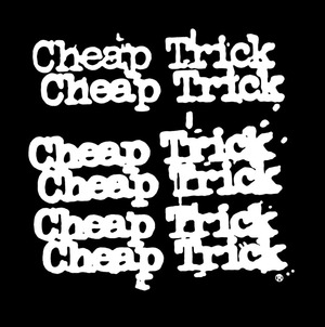
Being a big fan of the band and realizing they didn’t have a logo proper, Crowe set about creating one for kicks. With the graphic arts studio’s tools available at his disposal, he came up with the logo typography from an actual typewriter. Next, he blew it up using a Photostat machine before “further frying it by over-amping a Thermofax copier, allowing things to blur and go generally (crazy).” Eventually, he removed the clutter and debris from the logo so it was legible.
Crowe’s version was the right fit at the right time, and it has often been imitated but rarely properly duplicated.
“For years, people have tried to figure out what the font is (of the logo) and it’s never right,” Petersson said. “My wife is a graphic artist and she was trying to find out what it was and she goes, ‘There is no such font as this.’ There were variations of it when people would make their own version and it would be on a poster and all of a sudden the wrong one would be out there. We had stuff that had an incorrect logo on it — on records and all sorts of things.
“We got a lot of mileage out of it, for sure. It was one of those things that works. It was a stroke of luck. But it was good fortune that (Crowe) was there and he liked our band. It’s one of those things I wish I could take some credit for but I can’t. It was all his thing.”
For Nielsen the memories of the beginning of the logo were similar. He recollects Crowe presenting it to the band and Petersson taking a quicker shine to it than the others.
“(Crowe) came down one day and said, ‘I think this would be cool for you guys’,” Nielsen told writer Martin Popoff. “Our logo is the whole six (lines), not just one or the two. The name is Cheap Trick, but the logo is all six, and each one is kind of getting cruddier looking as it goes down. Tom immediately thought it was terrific, and the rest of us were like, well, it’s different, and it looks good on a shirt. And if it looks good on a shirt, that’s good.”
While neither the band or the Hollywood guy are hurting for money, Crowe gets a chuckle out of the fact he has never made a cent on something so well known the world over. Earlier in his career when working for Warner Bros., he’d be in the streets of Tokyo and see his logo everywhere.
“I’ve thought to myself, ‘If I had a nickel for every one of those things it’d pay for my dotage now,” Crowe said. “That would have been an actual sin against nature, though, because this was us against the world. It was not done for money, it was done with great affection and respect and I’d like to think that respect was mutual.
“Their longevity is so impressive that whenever I feel like I should be getting tired, I look to them and go, ‘Aww, if they can do it, I can load the typewriter’.”