As an IMVU customer, most catalog pages are a major let-down. You know, as the developer, that a ton of time has gone into creating a great product, but when a potential buyer clicks that enticing little catalog preview image to land on a plain white page with – maybe – a larger picture on it is seriously disappointing.
Give yourself a real chance to sell more IMVU products. Design a catalog page template that can be used for all your products and show off your work.
All IMVU Catalog Pages accept HTML, so you really have no excuse to bore potential customers. Instead, they should receive the full treatment and allowed to feel like they’re purchasing from a pro – and by presenting yourself as one, you’re that much closer to really being one. Promise – I know.
Getting Things Ready
In order to show off your product in HTML glory, you will need to have somewhere that you can host your graphics. Free image hosts are a great option for most people. Some image hosts require you to set up a free account, while others simply offer you a URL to use.
Take the time to find an image host you feel is reliable. A few out there include FreeImageHosting, Tiny Pic, Image Bam, Photo Bucket, and Image Chicken. I won’t even begin to give opinions on which is “the best” because everyone has their own preferences.
If you have your own website, you can host your images on your server. Just be sure that you create a folder that is specifically for IMVU “stuff” to keep things clean. As you become more popular, you will likely want to go this route so that potential buyers aren’t stuck with the “over-viewed” error for your images.
Ingredients
If you want to follow this tutorial exactly so that you end up with precisely the same catalog page in the previews, you will want to download these ingredients:
Background Image | Source HTML (for REFERENCE only!)
Most people will want to follow the tutorial using their own graphics, though, to end up with something more unique. All that is necessary is that you take note of pixels when they’re given. Other than that, feel free to mix the graphics up as much as you like so that your final page is all you.
Table Dancing
Creating a great IMVU Catalog Page requires more Dreamweaver than anything else. Why? Simple: you want graphical focus to be on the product you’re selling; the layout of the catalog page should enhance the product, not distract the customer from your work. Beyond that, you should strive to keep the number of graphics down so that your catalog page will load quickly. Let’s just admit that there’s nothing more frustrating than clicking on a product only to have to wait 5 minutes to see what it looks like.
1. Open Dreamweaver and create a new HTML document (File, New, HTML).
2. Let’s get things going by setting up our basic page properties. Click “Modify” in the toolbar and choose “Page Properties from the drop-down menu. The first set of options we will modify are the “Appearance” options. Starting from the top of the dialogue, first choose your text. The most common (and most recommended) option here is the “Verdana, Arial, Helvetica, sans-serif” option. Next, set your text size. For this layout, we’re going to use a text size of 12 pixels. Our backgrounds are going to be dark, so we’ll set our text color to white (#FFFFFF) and our background color to black (#000000).
Here’s where your first image URL comes in. To create exactly the page in the previews of this tutorial, you will need to upload the damask page background image. If you’re creating your own graphics, create a background image that is a seamless tile, in as small a file size as you can make it. No matter what way you do it, upload your background graphic and copy its URL. Paste the URL in the “Background Image” box. Then, make sure you set the next box to “repeat.
The only other option we will need to play with is the “Links”. Click it from the list at left to pull up the Links dialogue. Leave the link font alone (it should read “same as page font”), and go right down to the size. We’re going to keep the links the same size as our regular text and enter 12 pixels.
Now, it’s time to think about what colors you’re planning on using. For the catalog page in the previews, I decided that I wanted a very dark, dramatic, elegant look. I wanted high contrast between images and layout. So I’ve kept the background graphic monochrome grays, and plan on keeping everything else very dark and monochrome as well. So, to really set things off, I’m creating deep red (#660000) links. I don’t want the color of the links to change when someone rolls over them, clicks on them, or after they’ve visited a page. I just want the links to stay the same color all the time. So I’m setting every one of the link options to the same color.
When you’re done, click OK to continue on.
At this point, you should have a page with a simple tiled background on it. Refer to the 2nd illustration attached to this article.
4. Now we’re ready to start setting up the cells that our catalog page sections will live in. We’ll start with a single cell that is 915 pixels wide – the maximum width we can get away with. Click “Insert” in the toolbar and choose “Table” from the drop-down.
5. The first table cell is for our header image, which is why we’ve gone ahead and maxed its size out. For the body of our catalog page, we want two columns. So, make sure you place your cursor outside your first cell (you won’t see your cursor, but the cell won’t be highlighted anymore), hit Enter, and insert a second table that contains two columns. Then, with the table inserted, drag the “line” in the middle so that the left-hand column is 300 pixels wide.
6. Finally, we want a footer cell that will contain our copyright information. Do this exactly like you just did to add the 2-column cell, but make sure that it is only 1 column. What you’re left with should be similar to the 3rd illustration attached to this article.
Get Your Design On
We’re ready to start plugging in the graphics that will always stay the same – template elements, basically. We’re going to start at the top and work our way down.
Header
The header image is what will always introduce your products, so take some time with it. It should be sized at 915 pixels wide, and whatever height suits your design idea best. I’ve chosen to create a header that is 915 x 86 pixels.
Remember to echo colors and shapes that are used or going to be used elsewhere in your page. For example, the preview uses a dark floral background and red links. So the header I focused on also had floral elements and carried into it some of the dark red used for the links.
Section Headers
The left column of our catalog page will be broken into sections using small headers. These need to be a few pixels smaller in width than the column itself. So, for a 300 pixel column, the headers should be about 297 pixels wide. We’re going to need two header graphics: My Catalog and Credits.
To make room for these sections, add a table to your left column that is 1-column wide and 4 rows tall, sized 297 pixels. Then, add your header graphics to two rows, leaving a row in-between for content. Reference the 4th illustration attached to this article.
Fill In the Blanks
All that is left for us to do is … well, fill in the “blanks”. First, set the background color of every empty cell to your darkest color used. Then, type some form of copyright notice in your footer cell. I recommend something along the following lines (change it up as you see fit):
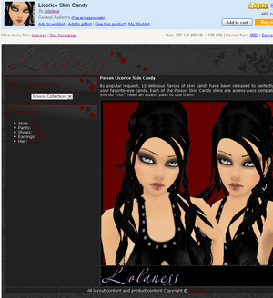
All layout content and product content Copyright © Lolaness
In the Credits cell, we’ll just put some “dummy” text – make a bulleted list of about 5 words (they don’t have to make any sense) and link them to #. This is where you will place links to the products used in your preview photos – even if they’re your own products, this is a great way to generate more sales, as well as keep other devs happy with you … which is always a good thing.
Now, it’s time to add a dummy description and a preview picture. You can use anything you want for your preview picture, it’s just there for the template. I recommend a preview picture sized 600 x 600 pixels, but the height is totally up to you – just don’t make the width larger or you’ll have things start to stretch out on your page.
I’ve used a temporary image that is from my own current catalog pages, so the colors don’t match up – but that’s not the point for now. Click in the space above your “My Catalog” cell, and in the properties section below your page, set the vertical alignment to “Top”.
I’ve saved the “My Catalog” cell for last because we’re going to do something fun with it – create a drop-down menu for visitors to choose from.
First, center your cursor in the “My Catalog” cell. Then, choose “Insert” from the toolbar, pick “Forms”, and click “Jump Menu”. Below is the dialogue. The settings you use are based on what options you want customers to choose from – by clothing type (Shirts, Pants, Shoes, etc.), by color, or by collection. Based on those options, you will need to provide the URL to that option. The easiest way to do this is to run a search for your own items. For example, to find the URL to my Darque collection, I ran a search for “Lolaness Darque”.
The name of the option goes in the top field (text), and the URL goes in the bottom field. To add another option, click the + button. You can always add to these options later on. When you’re done, click OK to insert the form. Your jump menu will pop right into the Catalog cell.
It’s time to save your catalog page template in a place it’ll be easily accessible. If you plan on playing around with a few styles of template, make sure to name it something descriptive so that you don’t have to preview each template in order to find the one you would like to use.
Using Your Template
Actually using your template is easy as pie – seriously.
First, go through your template changing the description text and the large preview image to the product you’re adding to the catalog (or editing to update with its fantastic new look).
Once you’ve got the template text and photos changed, uploaded to your image server, and your catalog preview image set, either Submit to Catalog or Edit an existing product.
You’ll wind up at the submission (or Edit a Product) page on IMVU. Give your item a title, and then copy-paste all the HTML code between and including the and tags into the Description box – reference the 5th illustration attached to this article.
Continue through the rest of the page adding your profit, catalog icon image, etc. and being very honest about the rating. When you’re done, click the Submit button to finish up.
Once your product is approved, you’ll be able to see it in all its full glory live on the internet. I promise, between having a great catalog page and a really good preview image, your IMVU sales (and the possibility of making some real cash) will dramatically increase as your exposure goes up.
You can also download this tutorial freely in PDF format for further browsing here. This PDF file is available exclusively through Associated Content and from this specific page. Any re-posting or sharing is illegal – please link to this page instead. Thank you!