Perhaps I’m a little odd, but I can’t think of anything cuter than teddy bears that are all dark and … well, kinda gothic. Granted, this is coming from someone who obsessively collects Bad Taste Bears just because they’re so wrong. What can I say.
This guide will walk you through the creation of a dark or “gothic” teddy bear illustration in just a few steps using Photoshop. To follow the guide to-the-letter, you’ll need Photoshop CS or CS2 – but you can achieve the same look with any version of Photoshop or graphic editors with the same tools … you just might have to look around for where those tools are located.
What are we aiming for? A dark “gothic” little teddy bear with a classic graphic look – and we don’t want to spend hours trying to achieve it. Simple.
Illustrating a Dark Teddy
One: First, we need some kind of reference to use. If you’re exceptionally good with a graphics tablet (and have one, besides) you can probably skip a reference picture – the rest of us will want one, though. The best kind of reference picture (besides being copyright free so you can use it legally!) will have some pretty clear lines, a teddy posed in a way that you like, and preferrably some patches and stuff to work with. I’ll be using this little bear I found at SXC – http://www.sxc.hu/photo/502469. Whatever image you choose, save it to your computer and open it up in Photoshop to get moving right along.
Two: Now, we need to prepare our colors and our canvas.
The canvas is easy – if the image you saved is at least 400 x 400 pixels in size or so, you’re fine. If it’s smaller or larger than that, you’ll want to adjust the image size by clicking “Image” and choosing “Image Size”. Just make sure that when you type in a new size, your box labeled “Constrain Proportions” is ticked – this way, your image won’t get all distorted out of shape. Do this even if you need to go up a couple hundred pixels – we don’t care if the original image gets pixellated, we won’t be displaying it anyways. We’re just using it as a reference. Finally, make sure your image is in RGB mode by clicking “Image”, choosing “Mode”, and clicking “RGB”.
Setting up colors is pretty easy too. We’re going to make a quick little color palette that we can select colors off of. To do this, create a new canvas (File, New) sized at 200 x 200 pixels in RGB mode. Then, select your paintbrush and make a few scribbles in these colors: #422f2f, #333333, #df0000, and black – #000000. These colors can now be picked up with the color dropper as we go along.
Three: It’s time to start “drawing”. Set your foreground color to black (#000000) and select your pen tool. Before you start clicking with your pen, though, you need to make sure that it is set to “Paths” (select the third icon from the left under your toolbar).
Using the pen tool this way is easy – you click once to start a path, and continue clicking around a shape to make the shape. Use as few clicks as you can to get smooth lines, and take it one piece at a time. So, for instance, don’t try to do the whole outline of the bear at once. Instead, start with (for example) his left leg. Work all around the leg until you close the path.
When you have a path closed, it’s time to stroke it. Right-click the path, choose “Stroke Path”, and make sure it is set to use a brush. Whatever brush you currently have selected in your brush palette is the one that will be used! Before you actually stroke the path, then, select your brush tool and set it to a 1 or 2 pixel round brush.
After you stroke the path, right-click it again and choose “Delete Path”. Continue working around the shapes of the bear this way. You can make life easier – and the image easier to edit – by doing each new shape on a new layer that you name clearly.
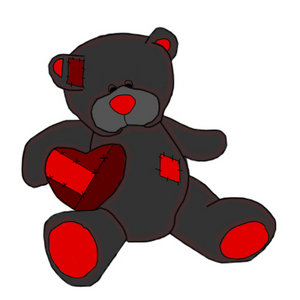
What you’ll end up with is an outline that is really nothing more than what you’d find in a coloring book. See Illustration 01 to view my outline and the doodled color palette.
Four: Yay! Now we get to be like big-kids and color! Sure, we’re using the computer to color … so that makes all the difference, right?
Using the colors you doodled out, start filling in the shapes of your teddy. You can add more colors if you want – but keep in mind that if you want this to stay a “dark” teddy, you’ll want to stick with just a few dark colors. For this step, you just want to use the basic gray (#333333) and red (#df0000). We’ll do touch-ups in just a minute.
When you’re coloring, using a round brush from the “Basic Brushes” selection and zoom in to 200 or 300 percent so you can color right up to the lines. I’ve done this all with a mouse – not a graphics tablet – so it CAN be done. Keep your coloring layers separate from your outlines, and drag them below your outline layers. What you’ll end up with is something like Illustration 02. (Note that I left some areas untouched in this illustration … it’s because I hadn’t decided yet what colors those areas would be – we’ll get to that in a second.)
Five: For our last step, we’re going to do the little touch-ups and play around with colors a bit to get just the look we want.
The touch-ups can come first, since they’re easiest. Basically, you’ll want to add just a bit of depth (shadow) to areas of your teddy using the second gray (#422f2f) in your color palette. Stick close to the outlines and don’t go overboard – it’s easy. The difference will barely even be noticible … which is exactly what we want. I used this as an opportunity to give my teddy sleepy eyelids.
Playing around with colors is pretty easy too, once you find the spot to do it properly. Set your foreground color to the red (#df0000) we’ve been using, and then click the foreground color box. If you look to the right, you’ll see the letters “H”, “S”, and “B”. To keep our color in the same shade but just change its intensity, click the “B” box (Brightness). You can now move the color slider up and down to get the red brighter or darker. This is perfect for filling in those extra little spots.
Keep playing with it until you have something you like – remember that art isn’t a science, it’s a preference. It’s the expression of your inner vision. Don’t let anyone tell you that you’re wrong … if you like it, you’re exactly right.