I can’t wait for the new line of trendy, minimalist Pepsi logos to die.
The Pepsi logo used in the 1985 Michael J. Fox Pepsi commercial is the logo I still associate with Pepsi. Bold, simple, classic. That 1985 Pepsi logo isn’t trying to be understated or “cool,” unless we’re talking about the ideal temperature of the Pepsi cans. What, exactly, are the newly redesigned Pepsi logos trying to say? Overcome with curiosity, I held a bottle of Pepsi up to my ear and listened.
“Why, hello there,” Pepsi said to me in a deep, smooth, Barry White-voice. “I’m so cool, I don’t really care if you drink me or not. I’m just going to sit here and smile at you, and hope that you choose me over Coke. Peace.”
What’s happening to all of our favorite PepsiCo products? New logos for Pepsi and all his friends!
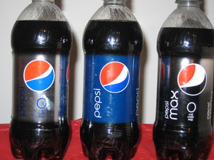
PepsiCo began introducing its new logos last October. We said bye-bye to upper-case, italicized “PEPSI” and hello to cute, lower-case “pepsi,” printed in a very unobtrusive, skinny sans-serif font. The classic, encircled, red-white-and-blue Pepsi wave unfurled and pulled up to the right. Each variety of Pepsi was given its own unique “smiling” wave emblem. Pepsi Max, just to be different, got a red-white-and-black wave-a “laughing” wave. (See figure 1; click the X in the top left corner to enlarge the pictures. If you pretend that the white part of the Pepsi wave is a mouth, you’ll notice that it’s grinning on the Diet Pepsi bottle, smiling on the Pepsi bottle, and laughing on the Pepsi Max bottle…or so they say.)
If you’re a die-hard Pepsi drinker, or interested in logos in general and want to read more about the new “smiling” look of classic Pepsi products, check out this ZLOK Logo Blog, where you can also watch Pepsi’s short video promoting the new logo and celebrating Pepsi logos of the past 110 years. Watch the new Pepsi wave logo morph into the Obama campaign logo! What a hoot! And the YouTube clip of the old Michael J. Fox Pepsi commercial I mentioned above is included at the bottom of the ZLOK blog. (Hey, I want a magical photocopier even more than I want an ice-cold Pepsi!)
If Pepsi had limited the new logos to its line of classic Pepsi sodas, I wouldn’t have cared too much. Nobody drinks Pepsi or Diet Pepsi or that newfangled “Pepsi Max” stuff at my house. But now Pepsi has stepped into my kitchen, so to speak, by tinkering with the Mountain Dew logo and the PepsiCo-owned Tropicana carton designs. I buy Diet Mountain Dew and Tropicana orange juice each and every week, so I noticed those changes immediately.
Why “Mtn” Dew? And what happened to that delicious-looking orange on my favorite Tropicana juice cartons?
Mountain Dew has suddenly become “Mtn Dew,” and Tropicana’s updated, hideously boring juice cartons do everything possible to not stand out on the grocery store shelf-that image of the lovely, scrumptious, juicy orange with the straw poking out its side is gone. WHY? PepsiCo is spending a reported $1.2 billion over three years to revamp the look of its key brands (click here to read the full article at www.underconsideration.com). Is it worth it? I say no way!
“Mtn Dew” has at least retained its vibrant green label. (See figure 2.) Check out those spiky green mountains-the peaks that represent your sugar-and-caffeine-fueled high-in the distance, behind the bold green and red letters shouting (yodeling?) “Mtn Dew.” Even with its shortened first name, “Mtn Dew” is no wimpy beverage. But are we supposed to still call it “Mountain Dew”? My husband has started calling it “Mitt’n Dew.” My seven-year-old son thinks it should be called “M-T-N Dew.” I briefly wondered why Pepsi didn’t abbreviate “Mountain Dew” as “Mt. Dew.” But who would want to drink something called “Mount Dew”? Whatever it is, Mitt’n Dew or Mount Dew or M-T-N Dew, my husband is addicted to it, and I will continue to buy it no matter what Pepsi decides to call Mountain Dew next.
But I absolutely detest the cheap, dull, new minimalist look of Tropicana, my favorite orange juice. (See figure 3.) I’m paying top dollar for juice that looks like the crappy store-brand! This stuff ain’t from concentrate, and I want the world to know it! I am very picky about my juice, but, thanks to some marketing “genius” at PepsiCo, I’m now subjected to the accusatory stares of ignorant strangers every time I go to the grocery store. They glance into my grocery cart, see those bland white cartons of orange juice, and think I’m a cheapskate with malfunctioning taste buds. I might have to switch to Minute Maid orange juice just to save my reputation. Nobody recognizes the new Tropicana cartons.
Each half-gallon variety of Tropicana juice now features a glass full of sickly, pale juice that wraps around the side of the carton. “Tropicana” is printed sideways in an unfamiliar font in skinny green letters. All Tropicana cartons are completely devoid of inviting pictures of juicy citrus fruit. Since I don’t have the different lid colors memorized yet, I have to carefully read the description on the carton to know what I’m getting. Is it orange-tangerine juice? Is it calcium and vitamin D-fortified? Is it pulp-free? Is it ruby red grapefruit juice? I don’t see much difference between the pale marigold color of the “orange” juice and the pale pink color of the “ruby” red grapefruit juice. Some picture clues would be helpful.
John Mamus, a professional graphic designer, rips apart the new Tropicana design in his blog here. He hates the new Tropicana design so much, he recently sponsored a contest to redesign the Tropicana packaging (but the contest deadline has already passed-darn it!).
Please, PepsiCo-I implore you to consider your loyal consumers before you ruin any more perfectly good product designs. What’s next? Taking the Quaker Oat man off the Quaker Oats label? (See figure 4. The Quaker brand is also owned by PepsiCo.) Don’t do it, PepsiCo! Are you trying to make me read the labels on all the products I buy? How dare you! Without those familiar prompts-the succulent orange with the straw poking out its side, the smiling Quaker Oat man-I am one confused, angry shopper. And I’m going to call the new Mountain Dew “Mitt’n Dew” from now on, just to spite you, Pepsi!
I can’t wait for the new line of trendy, minimalist Pepsi logos to die.
Recommended reading:
If you’re still not seeing the “smiles” or feeling the “gravity” of the new Pepsi logos, check this article out. It may be a hoax, but it’s still pretty darn amusing.
Jim Edwards of BNET Advertising makes the convincing argument in his article here that the new Pepsi logo looks a lot like an old Diet Pepsi logo. Maybe the new Pepsi logo isn’t so “new” after all!
I have to give Pepsi some credit: they put out some hilarious Super Bowl ads this year. Click here to read my article, “The Best Commercials of Super Bowl XLIII.
Sources:
All of the following websites were accessed on February 16, 2009.
http://www.pepsico.com/
http://www.zlok.net/blog/2009/01/17/pepsi-the-choice-of-a-new-logo-generation/
http://www.telegraph.co.uk/news/newstopics/howaboutthat/4591892/Pepsi-logo-design-document-sparks-internet-hoax-debate.html
http://www.thekmiecs.com/marketing/new-pepsi-logo-looks-like-obama-campaign-logo/
http://industry.bnet.com/advertising/1000270/pepsis-new-1-million-logo-looks-like-old-diet-pepsi-logo/
http://www.johnmamus.com/designeverything/2009/01/tropicana-design-critique.html


