When you have a large collection of mismatched art like I do, figuring out how to display them all can be hard to do. One challenge is finding a wall that gets lots of great light without being directly in the sun. Another challenge is arranging the art so that it works together despite a difference in shape, frames, media, and even subject matter.
Art galleries commonly face this problem which is why they often apply the principles of design when setting up an exhibit. The principles are the concepts used to organize the structural elements of a design such as harmony and balance. Here’s how to create a display wall of mismatched art in your home while using the principles of design:
Select a wall. A good display wall is one with lots of indirect lighting, a stable temperature, and out of harm’s way.
Measure the display area. This is the area where you plan to hang your collection of art work. In my home, the display areas average 42″-50″ in height and often run the entire width of a wall.
Draw the display dimensions on craft paper. This gives you a paper template in which to experiment and rearrange your collection of artwork so that it will fit nicely within the display area. If the grouping seems crowded, you may have to remove a piece of two. Likewise, if there is too much open space, you may need to add a few pieces.
Applying the principles of design. Most of us have an instinct for a well balanced design and can usually find a pleasing arrangement simply by arranging and rearranging the artwork until it looks right. Here’s how to apply the seven principles of design to your grouping.
1. Balance. As you move the artwork around the template, look at the pieces as if you were trying to balance them on a see-saw. Large pieces should be paired with a couple of small ones, a dark piece offset with a light one, and so on.
2. Gradation. A subtle change in size, direction, and color will cause the eye to move along the collection of artwork. While experimenting with your arrangement, shuffle the paintings around until the eye moves naturally from picture to picture instead of zeroing in on one piece of artwork and just staying there.
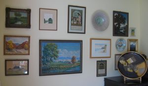
3. Repetition. Pattern and rhythm is what makes a grouping of artwork interesting to look at. This can be hard to pull off with a collection of mismatched art, but completely doable with a bit of effort. For my grouping of mismatched art, I introduced repetition through color (blues and green), the frames (rectangular vintage), and subject matter (predominately landscapes).
4. Contrast. This is the arrangement of opposite elements such as dark vs light colors, round vs. square shapes, smooth vs rough textures. If all your artwork is dark, think about introducing a few lighter pieces. If everything is square, consider adding a few round pieces.
5. Harmony. Harmony is all about the visually satisfying effect of combining similar items. Do the pieces work well with each other? If not, then remove the artwork that doesn’t belong and replace it with something that seems to be a better bit.
6. Emphasis. This is the one big thing that reaches out and pulls you in a painting or a grouping of paintings. Emphasis could be a specific color or a specific theme.
7. Unity. Unity pulls design elements together and show relationships . When grouping pictures together for a display, pay attention to the distance between the frames. A picture that’s too far or too close to the rest of the pictures looks like an afterthought instead of part of a collection.
Hanging the artwork on the first try. Once you’ve figured out the arrangement on the craft paper, use a pencil to trace around each piece of art. Cut out the shapes and hang them on the wall using painter’s tape, adjusting as needed to make sure the artwork lines up properly. (For heavy artwork, be sure that the picture is centered over a stud). Once all the paper shapes are up on the wall, use a pencil to mark the spot where the nail should go. Hammer in the bracket and then rip off the paper before hanging your collection of mismatched artwork on the wall.
More by this contributor:
How to take care of original oil paintings.
Under $100 redecorating ideas for spring.
How to mix leftover paint for DIY projects.