I’ve always loved decorating with color, but I didn’t always know how to do it. The disaster of spending three days faux painting my bedroom in orange hues that turned out oppressive and ugly (see for yourself), convinced me that decorating with color required more than a sea sponge and a long weekend.
Rather than shift to a monotone of earth-hues in my home decor, I decided to understand the nature of color, how it affects our mood, and how colors interact together. It was in this way that I discovered the principal of home decorating with a color wheel.
The History of the Decorating Color Wheel
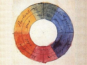
In 1810, Johann Wolfgang von Goethe, published his Theory of Color. Rather than analyze the light spectrum, Goethe studied our perceptions of it. This revolutionary approach to color was captured in his drawing of the color wheel (included with this article). Instead of a simple line that would simulate the visual spectrum of humanity, Goethe drew a color wheel where hues were ordered by their effect on human consciousness.
Goethe’s Color Wheel Becomes a Home Decorating Tool
Home decorating with color, as I learned from my bedroom fiasco, is more about my perceptions of color than about the color itself. In other words, Goethe was right. And it’s no surprise that his color wheel was adapted by interior decorators into what’s known today as the decorating color wheel. Today, for each of Goethe’s colors, a separate decorating color wheel exists, in which all the shades of purple can be studies, all the shades of red, blue and so on. There are also modern version of the complete decorating color wheel, which show many gradations between the main colors. Even so, when you’re just learning how to decorate with a color wheel, I find the simpler version easier to use.
How to Decorate Your Home with the Color Wheel
Let’s start by understanding the logic of the decorating color wheel. What you’re seeing are, in fact, relationships of color. Notice that what you and I would consider cool colors are clustered on one side of the wheel (green, blue, purple); while the warm colors are opposite (red, orange and yellow).
By decorating your home with the same “temperature of colors”, known as an analogous color scheme, you can introduce harmony to your decor and make smaller spaces feel larger.
To add interest, choose three analogous colors and then add a splash of a color from the opposite side of the wheel. Such colors are known as complimentary colors, for example: red and blue, or purple and yellow.
Finally, to truly master decorating your home with the decorating color wheel, work with what’s known as a triad of colors. Choose these by skipping over the colors separating them. Thus match: green, purple and orange, or blue, red and yellow.
Are you beginning to fathom the beauty of the decorating color wheel? I know! It’s a fabulous home decorating tool that anyone can learn to master.
I’d like to close with a look at the three primary colors on the decorating color wheel. After all, every other color is derived from yellow, red and blue. Therefore understanding the nature of these colors on the decorating color wheel will turn you into a real expert.
The Nature of “Yellow” on the Decorating Color Wheel
Yellow is a weak color; our perception of it changes depending on the colors it is matched with. Home decorating with yellow is especially effective on walls and ceilings. Yellow can come in a faint shade of sand, or warmer shade of sunshine, or an earthy caramel. All these color choices help to brighten a room and conceal texture flaws in walls. If you look at the decorating color wheel you’ll actually be able to see that yellow is best matched with the colors to its right, greens and blues, but not with the colors to its left, orange and red (which finally explains my bedroom fiasco).
The Nature of “Red” on the Decorating Color Wheel
Red is another primary color, but, unlike yellow, it is dramatic and powerful. Though we associate warmth with the color red, we also associate anger and blood with it. When decorating your home in red, the decorating color wheel will help you mitigate the violence of the color. Rather than use red in its primary form, use its gentler variations. These colors that borrow from adjacent hues are called analogous colors. A modern decorating color wheel (which is more detailed than Goethe’s) will show you gradations as red slips into orange and violet, and is thereby softened.
The Nature of “Blue” on the Decorating Color Wheel
Blue is the last primary color and, like yellow, it is a weak color in that it will feel different to the observer depending on the colors it is matched with. When decorating your home with the decorating color wheel, notice that blues make you feel cool and soothed. If you decorate small spaces in blue, they will feel larger for this reason. But large spaces may feel empty and cold. Using the decorating color wheel, pair blues with the reds opposite, and you’ll introduce the best of both worlds into your decor.
And now that you’ve become a decorating color expert, I invite you to experience 15 home decorating styles from Shabby Chic to Sunflower Decor, Cottage Decorating to Globe Decor and much more.
References:
1. Inventive Home Improvement: How Can Furniture color Affect Living Room Decor.
2. Dream Home Decorating: Color Wheel Chart.
3. Wikipedia: Theory of Colors.
4. eHow: How to Use Color Wheel Decorating.


