When you work freelance, you are constantly looking for new ways to do old things. Give yourself an edge on the competition. One of the most common freelance tasks I perform for clients is marketing – advertisements of all sorts, newsletters, brochures, etc. So when I discovered this concept of a postcard newsletter, let’s just say that I was playing in Photoshop for hours trying to deal with the flood of ideas it gave me.
Newsletters have a proven track record – they keep your name in front of prospects and loyal customers. This develops branding, which is worth its weight in gold. The problem is that newsletters take a lot of time to produce, to read, and cost a chunk of change to print and mail.
Postcards also have a proven track record, as long as you ditch the sales pitch. So why not combine the two and create a postcard newsletter that can be compiled quickly, printed cheaply, and mailed for pennies?
This guide will walk you through the steps of designing a postcard newsletter template in Photoshop which you can use over and over again. These same steps can be applied to similar print designs like full newsletters, e-zines, and e-postcards. All you need is a copy of Photoshop (I’ll be using CS2 in the illustrations) and some patience.
Step One: Gather Inspiration & Resources
The first step in any design project is the same: get some ideas, and get “stuff” to make those ideas possible.
In our case, we’re going to hunt down examples of postcards and newsletters that we like the look of. Try doing a Google Image Search for “Postcard” and “Newsletter”. What we’re hoping to find are 3-5 designs that really have the right look for our needs.
For the example I’ll be doing, I’m going to focus on an imaginary coffee shop. This coffee shop wants to market people who will buy their coffee beans, coffee/cappuccino/espresso makers, serving ware, etc. And this coffee shop also wants to focus on the “sophisticated” – a clientele with plenty of money to spend. These needs tell me exactly what I’m looking for in a design idea – something sharp, something clean, something that focuses on (what else?) coffee.
All the examples I found most interesting – because of their focus on illustration – you can view at http://www.phrizbie-design.com/postcard_design.html. With these ideas splashed across my Photoshop screen, I then started looking for resources – illustrations that would be perfect for my fictional coffee shop.
So what do you need at the end of this step? 3-5 designs that you like, and at least 1 graphic (a photo, illustration, logo, etc.) that you can legally (read copyright-free or created yourself) use to base the rest of your design on. Finally, you’ll need a postcard template sized appropriately so that the post office will actually mail it. Great blank ones are here: http://www.designedlykristi.com/freebies/postcards1.html. They’re in PDF format which will open fine in Photoshop as an image.
Step Two: Prepare the Canvas
If you downloaded one of the PDF templates from the link above, you can follow along here. Otherwise, you’ll need to make sure that your canvas is in RGB mode and that the templates are arranged to print four-to-a-page in landscape mode.
To get ready for designing, we need to create a new layer that contains all of the lines and writing. Do this by right-clicking “Layer 1” and choosing “Duplicate Layer”. Now, we need a background so we can see things more clearly – just drag a white square out between Layer 1 and Layer 1 Copy. Then, right-click it and choose “Merge Down” – this gets rid of the first template layer, which we don’t need anymore anyways.
Any text you don’t want (like the “This card was designed at…”) can be erased now. DO NOT remove the words “Post Card” or the stamp box … the post office requires these to be in place or they won’t mail your card.
Step Three: Block it Out
Now that we’re ready to get moving, we need to “block out” a layout that shows us where we’ll place different pieces of our newsletter postcards.
What pieces do we need? On the back, the left-hand side of the card can be one complete news story. So you’ll need a spot for a headline, and a spot for body text. You might want to use a small graphic to illustrate the story and keep the postcard looking lively.
On the front, we will want a block for our newsletter “header”. This can be a side-bar, or stretch across the top of the card depending on what your design idea dictates. Then, we’ll need room for a second, longer story and its headline.
Do this step just using the square shape tool. We’re not concerned with actual text or graphics yet, just indicating where they will go. Design 1 single card, and then duplicate its blocks to move into position on the other cards without having to re-do it all. See Illustrations 01 and 01A for my progress.
Step Four: Add Graphics & Sample Text
Let the fun begin! You now get to fill in all the blocks you’ve mapped out. Don’t stress on the actual text or anything, there’s no need to. Instead, focus on getting the right font, the right colors, and arranging the basic pieces where you want them to always remain.
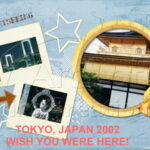
See Illustration 02 for the back of my postcard – the first illustration with this article is the front.
Step Five: Save & Print
Save a copy of both the front and back of your basic card layout as a .PSD by clicking “File” and choosing “Save As”. This format keeps all the layers separate, so you can edit things easy as you start producing your newsletter postcards.
When you print the first page, your “test” print, make sure that you use the highest quality settings – the same settings you’d use if you were printing a final copy. This way, you can see any color errors or spots that just don’t look right. You’ll use more ink, yes, but save yourself time in the long run.


